Tuesday, 15 January 2019

Start with Leaner Tools to Ease Non-Belts into Six Sigma

Six Sigma offers a variety of powerful tools that help organizations make data-driven decisions. Yet most people in an organization do not hold a degree in statistics and may feel that filling out endless data forms is pointless. When first starting a deployment, it is best to make things as easy and painless as possible for the non-Belt community. Once Six Sigma has gained momentum, Belts can enhance the statistical aspect and refine the methods they use.

Six Sigma Study Material, Six Sigma Tutorial and Material, Six Sigma Certification

Here are three examples for leaner tools that could be used to ease process owners and other non-Belts into the method during an initial deployment:

1. Failure Mode and Effects Analysis (FMEA)


If a Six Sigma team does everything manually in the standard FMEA template, it may need to fill in somewhere between 20 and 30 columns per row. To do that, team members may need to get thousands of data records from the process owner. And once the FMEA is complete, will the Champion even care if the risk priority number is 441 or 810?

When starting out, people may not even be capable of telling whether a defect occurs 7 percent or 70 percent of the time. But they do know what you need to be looking for – their most obvious pains. Most likely, the information Belts need from the process owner is this: What and where could something happen? Why would it happen? How bad is it? Who is going to do what about it, and is it effective?

That is a total of seven questions that almost everybody should be able to answer about their process. Asking these questions allows practitioners to get some data quickly, without misunderstanding or redundancy. As the initiative becomes more sophisticated, practitioners can work to refine the FMEA assessment process.

2. Analytic Hierarchy Process (AHP)


The AHP consists of simply going through a list of options and asking for each possible pair, Is (the first) more important than (the second) – and if so, by how much? But it can be tedious for larger amounts of options.

Time can be saved, however, by reviewing and optimizing the list beforehand, removing the unnecessary comparison questions. If the team already knows that gadget production is three times more important than widget production, why ask later if widget production is more important than gadget production? Taking that to the next level: If the team knows that gadget production is a factor three over widget production and that widgets are twice as important as trinkets – why waste stakeholder time by asking whether trinkets beat gadgets?

Optimizing AHP requires a bit of thought and definitely some information technology support. But for Belts doing the AHP on six factors, completing optimization first makes the difference between discussing 30 comparisons or nine. The AHP session may be condensed from two hours to 30 minutes, which key decision makers will appreciate.

3. Quality Function Deployment (QFD)


QFD is a support process for innovation and change, and also helps in assessing the status quo. It is nearly a science, and performs best in the hands of trained experts.

The information needed to first introduce QFD is not necessarily related to interactions, benchmarks and development status. What practitioners really need to know is: who is doing what, and why?

When practitioners know what requirements a process realizes, and what groups are engaged in the operation of the process, they have a solid basis for process improvement. They can still build intricate houses of quality later, when there is at least a formal requirement process.

Create Other Simplified Tools


The list does not stop here. With a small time investment studying a tool, chances are practitioners can find a simplified, leaner version that provides the information Belts really need from process owners in order to produce initial results.

Saturday, 12 January 2019

Analytical Hierarchy Process (AHP) – Getting Oriented

For a tool that has such broad applicability, the analytical hierarchy process (AHP) is not as widely known as might be expected. AHP makes assessments, prioritization and selection among options more readily measurable. Thus it is a natural Six Sigma ally and a part of the toolkit for a growing number of practitioners. AHP, which grows out of work that was done in the field of operations research by mathematician Thomas Saaty, has evolved into a rich set of methods with assessment and prioritization at their core.

The Challenge of Prioritization


When asked to rank or rate a list of things according to some criterion, such as preference, value, risk or cost, one might be able to rank their order and even to assign some numbers to their relative positions on the list. However, two problems arise in that simple scenario:

First, whatever measurement scale is chosen is just ordinal at best. A rating of 10 does not mean the preference, risk or whatever for an item is twice that of an item rated 5. (One might be tempted to treat the numbers as a ratio scale, but there is no basis for it.)

Second, when there are more than a few items on the assessment list, it gets hard to keep all the prioritization considerations in one’s mind at the same time – making it hard to think about and to complete the task.

The AHP Answer


AHP takes that simple-enough looking prioritization problem and makes it simpler and more meaningfully measurable. First, it reduces the list into pairwise comparisons and asks for a ratio assessment of each pair. Using a simple case to illustrate, to assess preference for three features, A, B and C, AHP would set up the three pairwise comparisons (AB, AC and BC).

Making a relative assessment of the members of each pair is something most people find easy to do. Figure 1 traces the preference assessments for three simple requirements – File Type Conversion, Localizability and Compatibility with Legacy System.

Evaluation (Figure 1) shows File Type Conversion is somewhat more important than Localizability, 4.0 transferred to the table below. Compatibility is much more important than Localizability, 9.0 transferred to table. Compatibility is just a little more important than File Type Conversion, 3.0 transferred to table. AHP captures each assessment, and then computes the ratio-scaled priorities and an “inconsistency ratio” of 0.01, as noted in Table 1.

Analytical Hierarchy Process (AHP), Six Sigma Certification, Six Sigma Study Material
Figure 1: Assessment Evaluation

Table 1: Assessments Gathered in the AHP Matrix

File Type Conversion Localizability Compatibility with Legacy System 
File Type Conversion 4.0 3.0
Localizability 9.0
Compatibility with Legacy System
Inconsistency Ratio 0.01

Assessing Inconsistency


An interesting side effect of asking a person to make a series of pairwise ratio-based comparisons is the way that they “forget” prior assessments as they go. If their understanding of the system is coherent, the whole set of pairwise comparisons should stack up in a self-consistent way. In a preference assessment, if a person places A much greater than B, then A slightly greater than C and then B slightly greater than C, they have created a set of circumstances that do not make sense as a whole. They have revealed inconsistency in their thinking on the matter. (See Figure 2.) That could show that a respondent was not paying attention or that they do not understand the dynamics of the assessment well enough to see things clearly.

Analytical Hierarchy Process (AHP), Six Sigma Certification, Six Sigma Study Material
Figure 2: Graphical Display of AHP Assessments

Inconsistency ratios (which involves some matrix math) of greater than about 0.1 are generally viewed as worthy of concern. Ratios smaller than 0.1 reflect a pretty coherent set of assessments. As a companion to AHP preference rankings, the inconsistency ratio provides useful guidance about how to interpret information coming back from an individual or a group.

AHP for Groups


AHP can be especially useful with groups. Each member’s assessments can, of course, be evaluated for priorities and inconsistency, and then the group rollup (and group segments) can be synthesized and viewed the same way (note the second bar graph in Figure 2). This can be a powerful way to build consensus, as each constituent can see where they stand and compare it to the group as a whole. If the group has a high inconsistency ratio (more than 0.1, or so) segmenting might reveal where the differences in agreement are and why. That, too, can help lead to better understanding and consensus.

Thursday, 10 January 2019

Building Valuable Process Maps Takes Skill and Time

Six Sigma Tutorial and Material, Six Sigma Guides, Six Sigma Learning, Six Sigma Certification

Practitioners who think process mapping can be completed in a two-hour session with a group of subject matter experts, a white board and some sticky notes are likely to end up with a nice piece of paper with a bunch of squares and diamonds. This is because process mapping is not for wimps. Creating a process map that tells a full, data-based story requires a decent amount of time and effort by those individuals involved in the process.

Gathering Information


A great process map should show, with certainty, where improvements can be made, where cycle time delays exist and where smooth handoffs are not taking place. Creating a process, or value stream, map should be the first act a company performs when seeking to make process improvements. If they start more advanced process improvement methodologies without completing a value stream map first, organizations may make a slower start on their road to improvement. Of course, practitioners should not avoid these advanced methodologies. But they will benefit from beginning with a process map, which can make an immediate impact – immediate in the sense of less than three months.

Again, process mapping is not an easy undertaking. It is the perfect combination of business acumen and art. It takes special talent to interview individuals and get them to explain exactly what they do in their job every day, as well as share their pains and express their wants. In fact, it takes the ability to connect with many different types of people and personalities, the know-how to ask questions that will effectively prompt the interviewee and the listening skills to understand what a person is saying – without judgment or prejudice.

A skilled practitioner may ask some of the following questions during an interview to capture process owners’ pains and wants:

◈ What parts of the process do you seek to eliminate, and why?
◈ Where do you spend most of your time, and why?
◈ Where in the process do you repeat work? How often, and why?
◈ What does your manager think happens in the process? What really happens?
◈ When pressed for time, what steps in the process do you skip or work around?

But what about the data-based story component? Well, to perform a true value stream mapping exercise, data must be collected in conjunction and concurrently with the interviews. Questions to collect this data may include:

◈ Where do cycle time delays exist?
◈ Where do handoffs take place?
◈ Do people actually hand something off, or is it submitted to a system with the assumption that it is handed off?
◈ What data points are put into systems? What data points are taken out?
◈ What pains does the process cause? What do people want or desire from the process?

Gathering data is the real power of performing process mapping. The master plot, the final map with all the details, is great for showing people the process, but the juicy stuff is in the data that is collected.

Sample Process Map


The figure below is a picture of an end-to-end sales process; in real life it is eight feet long. The green boxes represent steps where cycle time delays exist. The yellow boxes are manual steps where automation can take place. The lines coming in and out of the circles (multiple systems) indicate data that comes in or out of a system.

Six Sigma Tutorial and Material, Six Sigma Guides, Six Sigma Learning, Six Sigma Certification
Sample Process Map

One of the practitioner’s challenges is to identify exactly how many handoffs there are in the process, and how many inputs go into a system but never get taken out. However, the absolute biggest benefit comes from taking steps out of the process. Once changes have been made, practitioners can calculate a return on investment and assign value to each step in the process. 

Five Key Tips


The following are some tips and tricks for process mapping any process in an organization: 

◈ Scope the process: Clearly define a start and stop in the process.

◈ Identify metrics of importance: To give the effort value, practitioners should determine what they want to eliminate from the process – process steps that generate cycle time, steps where individuals seek approvals, steps where individuals perform manual effort and so on. These will become the steps to color code as action items.

◈ Select a map collection method: Process mapping can be performed using sticky notes, a spreadsheet or technical drawing software program, or paper and pen. Practitioners should select the method that works best for them and their organization.

◈ Validate the process maps: After completing a first round of interviews, practitioners should have someone within the organization who is familiar with the process read the maps. This person should check for clarity, content and continuity. The practitioner can review the feedback with the original interviewee for confirmation.

◈ Minimal interviewees at one time: Practitioners should not attempt to create process maps with large groups. It is best to interview one or two people at a time, therefore reducing social conversation and the desire to correct the process during the mapping session.

Tuesday, 8 January 2019

Estimation Method Aids in Analyzing Truncated Data Sets

Six Sigma Tutorial and Materials, Six Sigma Guides, Six Sigma Learning

When working with data sets, practitioners sometimes encounter metrics, such as out-of-roundness and loss-of-moisture measurements, with physical limits. In these scenarios, the data distribution is truncated at the value of physical limitation, creating a distribution outside of the criteria of a normally distributed population. With non-normal data, estimates and predictions using the normal distribution are not accurate, creating the need for alternative methods of analysis to assess the data.

Standard Methods


Typically, when data does not fit the normal distribution and prediction or estimation calculations are made using the assumption of normality, data is transformed and assessed for normality. If the transformed data fits the normal distribution, then calculations are performed using the transformed data with transformed specification limits. Alternatively, if other distributions are found that fit the non-normal data, the capability of the process can be calculated using an alternative distribution, which better fits the data. However, if no alternative distribution is found that fits the data and the data cannot be transformed into a normally distributed data set, other methods of analysis are necessary.

Alternative Method


Due to the nature of truncated data sets, which have a point of central tendency at a physical limit, common transformation methods such as Box–Cox and Johnson are often not sufficient. The following method of estimating the population’s standard deviation for the normal distribution is a practical method that gives a realistic estimate of the standard deviation. It also avoids violation of the assumption of normality when using the Cpk calculation based on the normal distribution. This correction provides practitioners with the ability to predict the spread of the data and assess capability in the direction of the upper specification limit. Prior to using this correction method, however, practitioners must verify that the sample data is of adequate size to approximate the normal distribution.

Six Sigma Tutorial and Materials, Six Sigma Guides, Six Sigma Learning

Empirical research and data results, gathered from both theoretical and production data and analysis, support the theory that estimating the standard deviation is possible for physically limited data by proceeding as if the data were not truncated. Theoretically, this means extending the data beyond the physical limitation of the measurement.

The empirical evidence provides a ratio, or correction factor, between the truncated distribution standard deviation and the theoretical normal distribution. The equation is:

Six Sigma Tutorial and Materials, Six Sigma Guides, Six Sigma Learning

where

Six Sigma Tutorial and Materials, Six Sigma Guides, Six Sigma Learning
is the standard deviation calculated from the physically limited data set truncating one side of the data.
Six Sigma Tutorial and Materials, Six Sigma Guides, Six Sigma Learning
 is the standard deviation calculated for the population if the data were not truncated.


The coefficient of 1.7 correlates these two parameters.

This ratio can act as a correction factor for the standard deviation, allowing practitioners to calculate the Cpk based on the assumption of normal data. An accurate calculation of process capability or any other estimate or prediction made using the normal distribution is not valid without this type of correction. In the following example, the standard deviation is estimated for the population using the correction factor.

Example Data Description


In the figure below, the distribution is truncated as it approaches approximately zero readings of moisture. This truncation is due to the physical limitation of the zero bound on a moisture reading (i.e., a product cannot have less than zero units of moisture present). Hence, the data is not able to follow the normal distribution.

Six Sigma Tutorial and Materials, Six Sigma Guides, Six Sigma Learning

Figure 1: Moisture Readings in Batch 3

This truncation can cause the central tendency measurement to match the physical limit value if that is desirable. With out-of-roundness and loss-of-moisture measurements, often there is only an upper specification limit and it is desirable to have low values, as is the case with the data in Figure 1.

The standard deviation for this example data set is 0.3735 units. The estimated (or corrected) standard deviation for the example data set as a normally distributed data set is 0.3735 units multiplied by 1.7, which is equal to 0.6350 units. The mean from the example data set is 0.2746 units. The specification limit is a one-sided upper specification limit (USL) of 8 units.

The following equation is typically used to calculate process capability:

Six Sigma Tutorial and Materials, Six Sigma Guides, Six Sigma Learning

USL and LSL are upper and lower specification limits

Six Sigma Tutorial and Materials, Six Sigma Guides, Six Sigma Learning
 is the population standard deviation

Six Sigma Tutorial and Materials, Six Sigma Guides, Six Sigma Learning
is the population mean

However, because no LSL exists in this case, the equation is reduced to:

Six Sigma Tutorial and Materials, Six Sigma Guides, Six Sigma Learning

This alternative process capability estimation can be used for further analysis.

Friday, 4 January 2019

Actionable Information from Soft Data

Engineers, Six Sigma practitioners and other researchers often work with “hard” data – discrete data that can be counted and legitimately expressed as ratios. But what of “soft” data, things like opinions, attitudes and satisfaction? Can statistical process controls (SPC) be applied here? Can process variation in customer satisfaction, for example, be measured and then reported to management in a meaningful way? Can we leverage “appeal,” “responsiveness” or “value for money spent”?

In Visual Explanations, Edward Tufte demonstrates how the NASA Challenger disaster may have been avoided if the Morton Thiokol engineers had displayed their temperature vs. o-ring failure data in a meaningful way. They had all the data they needed – but it did not get translated into information. In a similar fashion, a well-designed survey or comment card will gather a wealth of data. The process of turning soft data into information (assuming the data are valid) is two-fold: knowing what to extract and knowing how to display.

Information Extraction


Visual Inspection and Intuitive Statistics

Visual inspection of data is paramount to understanding it. Raw data, midpoints, ranges, and frequency distributions need to be examined visually before feeding it to a computer for advanced analyses. The need for complete familiarity with the distribution cannot be over stated. Two aspects of data that must be inspected are magnitude and consistency: How much and how many? Inspection will reveal outliers and provide relatively accurate estimations of the median, mean and standard deviation (this requires a bit of practice). The shape of the distribution will indicate if there is a problem with normality.

Data consistency, often overlooked, should also be examined. Consider the situation of an experiment with six sub-comparisons, each one insignificant, but with all six differences pointing in the same direction. The researcher concludes no differences, but six consistent events yields a probability of .016, a rare event in its own right. No matter how good the statistical software, there is no substitute for human intervention at the right point. The foregoing is meant to help the researcher get a “feel” for the data, since a lack of understanding of the data will be easily transmitted to decision makers.

Leverage

Computer-calculated means and variances should be confirmatory at this point, assuming you have at least interval level data (data are rank-ordered, and have equal intervals between the numbers). We can now consider the item means (from a survey, for example) as performance indicators of small, individual processes. The means tell us how well each item is performing. But how do we know which processes are important and which are irrelevant?

In a well-constructed survey, there will always be one item which captures the overall meaning of the survey results: In an employee satisfaction survey, for example, it might be “I like my job” or “I like working here.” All items on the survey should be pointing, somehow, to this bottom line. If we run correlations of each survey item with the bottom line, satisfaction in this example, we can see how well (or poorly) each item relates to satisfaction.

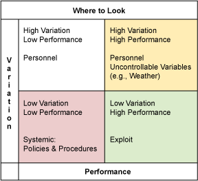
This is leverage: the correlations reveal which items make a difference, and by how much, to overall satisfaction. We can see which items need to be “leveraged”. By plotting a two by two table of Performance vs. Leverage (means vs. correlations), we can see where to focus first in order to 1) fix problems and 2) exploit what we do best. (See Table 1.) Caveat: Correlation does not mean causation, it only means a relationship exists. There may be an intervening variable that is responsible for causation. A root cause analysis, starting with the low performance, high leverage items, should be conducted, after examining process variation (see below).

Six Sigma Study Materials, Six Sigma Guides, Six Sigma Learning, Six Sigma Certifications
Table 1: Leverage Analysis

Process Variation

But what of the variation in these item processes? The coefficient of variation (Cv: the item mean divided by its standard deviation) provides an indicator of process variation for our soft data. It provides information regarding control and consistency. Some items, by their nature, will suggest where to start looking for root causes of problems, but not all. Looking at performance versus process variation may hold a clue for these items. Knowing that, in general, policies and procedures are static and consistent, and that people are dynamic and inconsistent, we can make an initial stab at where to focus on fixing some problems. Consistently low performance suggests a systemic problem, which in turn suggests that policies, procedures, methods, etc., may be a root cause. Any inconsistent (high Cv) performance suggests that people are influencing the variation: training, supervision/leadership, working conditions, etc., are some areas to consider for your fishbone diagram. By plotting the Cv versus performance (means) in a two by two table, the results identify consistently high performance items, consistently low performance items, etc. We now have performance and process variation data charted in a meaningful way (see Table 2). To see the relationship of the Cv to the frequency distribution graphically, see Table 3. This is intuitive.

Six Sigma Study Materials, Six Sigma Guides, Six Sigma Learning, Six Sigma Certifications
Table 2: Process Analysis

Actionable Information


Making Data Understandable

Displaying technically derived data (means, variances, correlations) to decision makers will require explanations that may overshadow and obscure the actual information to be conveyed. For example, explaining that there is a statistically significant difference between a mean of 5.84 and 5.43 on a 7-point survey scale will not promote your mission or your conclusions.

Consider converting everything to percentages: this allows easy comparison across all items, as well as quick evaluation of each item. The numbers above convert to 83 percent and 78 percent, respectively. Everyone can quickly see and evaluate a difference of 5 percent with minimal explanation. The leverage data, currently in the form of correlations, should be converted to shared variance: square the correlation and multiply by 100. The display of an item with 60 percent leverage versus one with 30 percent makes technical explanations unnecessary – the boss can see which one is more important and by how much, and has a good understanding of why. Next, convert the Cv (standard deviation/mean) to a percentage by multiplying by 100. The only explanation required here is “lower is better” (Six Sigma standards will rarely apply to soft data). The beauty of these conversions is that the information contained in the data has not been lost or altered: information integrity remains intact, but now it is understandable at a glance.

The (Almost) Holy Grail

We now have information that is approaching action ability: performance, leverage, and process variation expressed in a recognizable format. If your survey has been well designed, you will also have collected some demographic data (it does not take much). Sort performance, leverage and variation by the demographic data – the derived information will change with each sort, specific to each demographic. We now have target groups.

Using the two by two tables we can demonstrate, by target group, which items are important, in control, performing well, and should be exploited: this is what we do best, capitalize on it. We can also identify which items need to be fixed, and in order of priority. Some items, by their nature, will suggest where to start looking for root causes, but not all. The performance versus process variation table may hold a clue for these items. Knowing that, in general, policies and procedures are static and consistent and that people are dynamic and inconsistent, we can make an initial stab at where to focus on fixing some problems. Consistently low performance suggests a systemic problem, which in turn suggests that policies, procedures, methods, etc., may be a root cause. Any inconsistent (high Cv) performance suggests that people are influencing the variation: training, supervision/leadership, working conditions, etc., are some areas to consider for your fishbone diagram.

Your committee, boss and CEO now have rich information regarding what to exploit, what to fix, and where to look. A question that often arises at this point is, “Anyone have any ideas on how to do this?” If the survey was well designed, it solicited comments in such a way that it greatly increased the chances of garnering actionable ideas: “Give us ONE good idea on how we can improve xxxx.” This is a simple and focused task, rather than a vague request, and tends to elicit actionable responses. Review all comments (data inspection). Review them again, this time looking for themes. Group the comments by theme. Your customers, employees, constituents, etc., can generate a smorgasbord of ideas. Enjoy the buffet.

Once you have a feel for your data, you can run these (relatively) simple analyses and comparisons and display clear and powerful information that provide road maps for action.

Six Sigma Study Materials, Six Sigma Guides, Six Sigma Learning, Six Sigma Certifications
Table 3: Getting a Feel for Data

Thursday, 3 January 2019

Determine The Root Cause: 5 Whys

Asking “Why?” may be a favorite technique of your 3-year-old child in driving you crazy, but it could teach you a valuable Six Sigma quality lesson. The 5 Whys is a technique used in the Analyze phase of the Six Sigma DMAIC (Define, Measure, Analyze, Improve, Control) methodology. It is a great Six Sigma tool that does not involve data segmentation, hypothesis testing, regression or other advanced statistical tools, and in many cases can be completed without a data collection plan.

Six Sigma Tutorial and Material, Six Sigma Guides, Six Sigma Study Materials

By repeatedly asking the question “Why” (five is a good rule of thumb), you can peel away the layers of symptoms which can lead to the root cause of a problem. Very often the ostensible reason for a problem will lead you to another question. Although this technique is called “5 Whys,” you may find that you will need to ask the question fewer or more times than five before you find the issue related to a problem.

Benefits of the 5 Whys


◈ Help identify the root cause of a problem.
◈ Determine the relationship between different root causes of a problem.
◈ One of the simplest tools; easy to complete without statistical analysis.


When Is 5 Whys Most Useful?


◈ When problems involve human factors or interactions.
◈ In day-to-day business life; can be used within or without a Six Sigma project.


How to Complete the 5 Whys


1. Write down the specific problem. Writing the issue helps you formalize the problem and describe it completely. It also helps a team focus on the same problem.

2. Ask Why the problem happens and write the answer down below the problem.

3. If the answer you just provided doesn’t identify the root cause of the problem that you wrote down in Step 1, ask Why again and write that answer down.

4. Loop back to step 3 until the team is in agreement that the problem’s root cause is identified. Again, this may take fewer or more times than five Whys.

5 Whys Examples


Problem Statement: Customers are unhappy because they are being shipped products that don’t meet their specifications.

1. Why are customers being shipped bad products?

– Because manufacturing built the products to a specification that is different from what the customer and the sales person agreed to.

2. Why did manufacturing build the products to a different specification than that of sales?

– Because the sales person expedites work on the shop floor by calling the head of manufacturing directly to begin work. An error happened when the specifications were being communicated or written down.

3. Why does the sales person call the head of manufacturing directly to start work instead of following the procedure established in the company?

– Because the “start work” form requires the sales director’s approval before work can begin and slows the manufacturing process (or stops it when the director is out of the office).

4. Why does the form contain an approval for the sales director?
– Because the sales director needs to be continually updated on sales for discussions with the CEO.

In this case only four Whys were required to find out that a non-value added signature authority is helping to cause a process breakdown.

Let’s take a look at a slightly more humorous example modified from Marc R.’s posting of 5 Whys in the iSixSigma Dictionary.

Problem Statement: You are on your way home from work and your car stops in the middle of the road.

1. Why did your car stop?
– Because it ran out of gas.

2. Why did it run out of gas?
– Because I didn’t buy any gas on my way to work.

3. Why didn’t you buy any gas this morning?
– Because I didn’t have any money.

4. Why didn’t you have any money?
– Because I lost it all last night in a poker game.

5. Why did you lose your money in last night’s poker game?
– Because I’m not very good at “bluffing” when I don’t have a good hand.

As you can see, in both examples the final Why leads the team to a statement (root cause) that the team can take action upon. It is much quicker to come up with a system that keeps the sales director updated on recent sales or teach a person to “bluff” a hand than it is to try to directly solve the stated problems above without further investigation.

5 Whys and the Fishbone Diagram


The 5 Whys can be used individually or as a part of the fishbone (also known as the cause and effect or Ishikawa) diagram. The fishbone diagram helps you explore all potential or real causes that result in a single defect or failure. Once all inputs are established on the fishbone, you can use the 5 Whys technique to drill down to the root causes.

Tuesday, 1 January 2019

A Solution Template to Help in Hypothesis Testing

One of the most difficult topics for those learning how to use statistics is hypothesis testing. Solving a number of examples will help convince potential and new Six Sigma practitioners of the importance of the concepts behind this tool. However, the necessary steps and their formulation take some additional effort. An appropriately designed solution template for this purpose can ease the difficulties of the learning process.

Suppose that we want to decide whether the mean (m) of the population under consideration exceeds, does not exceed or differs from a given value (m0). To make that decision, we take a random sample, compute the mean (), and then apply a statistical inference technique called hypothesis testing. First, we describe the hypothesis tests for one-population mean. The results from this exercise will translate to other hypothesis-test analogies of the one-sample z-interval and one-sample t-interval confidence-interval procedures, respectively. The third is a nonparametric method called Wilcoxon signed-rank test, which applies when the variable under consideration has a symmetric distribution. For other hypothesis tests beyond the tests for one-population mean, the formulas for test statistics (Z) will be used in Step 3 instead of test statistics:

Hypothesis Testing, Six Sigma Tutorial and Material, Six Sigma Guides

Hypothesis Tests for One-population Mean


We will solve the following hypothesis tests for a one-population problem using the template to be designed. The solution text will appear as underlined or as a choice to be selected or deleted, appropriately.

Example: The Food and Nutrition Board of the National Academy of Sciences states that the recommended daily allowance (RDA) of iron for adult females under the age of 51 is 18 milligrams (mg). A sample of iron intake in was obtained during a 24-hour period from 45 randomly selected adult females under the age of 51. It revealed that the sample mean () was 14.68 mg. At the 1 percent significance level, does the data suggest that adult females under the age of 51 are, on average, getting less than the RDA of 18 mg of iron? Assume that the population standard deviation is 4.2 mg.

Hypothesis Testing, Six Sigma Tutorial and Material, Six Sigma Guides

P-Value Approach to Hypothesis Testing


This can also be modified to examine a second approach to hypothesis testing, the p-value approach with a minor modification. The p-value (also known as the observed significance level or the probability value) indicates how likely or unlikely observation of the valueobtained for the test statistics wouldbe if the null hypothesis (H0) is true. In particular, a small p-value (close to 0) indicates that observation of the value obtained for the test statistics would be unlikely if the null hypothesis (H0) is true. Accordingly, Steps 4 and 5 will be modified as follows for the p-value approach. For a two-tailed test, as required, the amount a of will be halved in the alterative Steps 4 and 5.


Hypothesis Testing, Six Sigma Tutorial and Material, Six Sigma Guides

Using Control Charts or Pre-control Charts

Every process falls into one of four states:

1. Ideal: produces 100 percent conformance and is predictable
2. Threshold: predictable but produces the occasional defect
3. Brink of chaos: not predictable and does not produce defects
4. Chaos: not predictable and produces defects at an unacceptable rate

Processes tend to migrate toward chaos if not effectively managed.

Pre-control Charts


There are two basic philosophical differences between those who support control charts (or Shewhart charts, named for their developer, statistician Walter A. Shewhart) and those who support pre-control charts. The pre-control folks tend to view any product within specification as being of equal good. All outcomes are considered to be “good” or “bad” and the dividing line is a sharp cliff. A part that barely meets specification is as good as a part that is perfectly centered on the target (T) value. Producing product tighter than the specification limits is viewed as an unnecessary expense.

Six Sigma Tutorial and Materials, Six Sigma Learning, Six Sigma Guides, Six Sigma Study Materials

Figure 1: “Good” Within Product Specifications

Rath & Strong consultants, including statistician Frank Satterthwaite, developed pre-control charts in the 1950s. This technique focuses on the voice of the customer in that the pre-control limits are based on upper and lower specification limits (USLs and LSLs). These limits are chosen such that the hard stop limit to pre-control charts are at the customer specification and cautionary limits are at ±50 percent of the specification (see Figure 2).

Six Sigma Tutorial and Materials, Six Sigma Learning, Six Sigma Guides, Six Sigma Study Materials

Figure 2: Example of a Pre-control Chart

To establish process capability, five consecutive units must fall between the pre-control limits in the green region. After this condition is met, two successive units are periodically sampled. If the two units fall in the green zone, continue production. If one unit falls in the green zone and the other falls in the yellow, continue production. If both units fall in the yellow zone, stop and adjust the process. If one unit falls in the red zone, stop and adjust the process. To resume normal production five units in a row must be within the green zone. The sample frequency is determined by dividing the interval between stoppages by six.

Control Charts


Control chart philosophy more closely follows the Taguchi Loss Function even though control charts were developed in the 1920s and the Taguchi Loss Function was not introduced until the 1960s. The Taguchi Loss Function states that as the parameter (x) varies about the target (T) there will be a loss [L(x)] to society. Thus, a part produced at the target is more valuable than a part produced at the specification limits. This is because throughout the value stream accommodations have to be made to be tolerant to that variation from the target value. That adds cost to subsequent steps in the value stream. (See Figure 3.)

Six Sigma Tutorial and Materials, Six Sigma Learning, Six Sigma Guides, Six Sigma Study Materials

Figure 3: Taguchi Loss Function

Shewhart chart control limits are chosen so that time is not wasted looking for unnecessary trouble. The practical goal is to take action only when necessary. Control limits are calculated by estimating the standard deviation of the sample data adjusted for sample size and multiplying that number by three. That number is then added to the average for the upper control limit and subtracted from the average for the lower control limit. Shewhart gave us constants to use that ease these calculations. The control chart tests are design to flag points that are not behaving “normally” (i.e., exhibiting special cause variation).

The Shewhart chart focuses on the variation that is due to the process itself. Control limits are developed from the process data and not tied to the specification limits. This is commonly referred to as voice of the process (VOP) as the process is providing information about itself.

Six Sigma Tutorial and Materials, Six Sigma Learning, Six Sigma Guides, Six Sigma Study Materials

Figure 4: Example of a Control Chart

Shewhart charts determine what kind of variation the process is exhibiting. Common cause variation is systemic, chronic variation that is produced by any process. It is often thought of as “random” variation and is produced by the process itself. It can be large or small. Special cause variation is caused by a unique disturbance. It is unpredictable and can be large or small. The cause may be known or unknown and is not always bad.

What is the concern in identifying our observed variation as common cause or special cause? Treating common cause variation increases variation as illustrated by Dr. W. Edwards Deming’s funnel experiment described in Out of Crisis. The experiment shows that treating common cause as special cause degrades process performance. Dr. Deming called this tampering.

Figure 5 displays results from a simulation to illustrate the effect of tampering. It shows that treating common cause variation as special cause variation greatly increases variation from the target value; by treating common cause like special cause, the problem worsens. If special cause variation is treated like common cause variation, the root of the problem is not found. Additional variation and cost to the process are likely to be introduced.

Control Chart Test for Special Cause Variation


There are eight control chart tests that can be done to reveal special cause variation. (Refer to Figure 4 for Zone references.)

1. One point beyond Zone A detects a shift in the mean, an increase in the standard deviation or a single aberration in the process.

2. Out-patient workload

3. Nine points in a row in a single (upper or lower) side of Zone C or beyond detects a shift in the process mean.

4. Six points in a row steadily increasing or decreasing detects a trend or drift in the process mean. Small trends will be signaled by this test before Test 1.

5. Fourteen points in a row alternating up and down detects systematic effects such as two alternately-used machines, vendors or operators.

6. Two out of three points in a row in Zone A or beyond detects a shift in the process average or increase in the standard deviation. Any two out of three points provide a positive test.

7. Four out of five points in Zone B or beyond detects a shift in the process mean. Any four out of five points provide a positive test.

8. Fifteen points in a row in Zone C, above and below the center line detects stratification of subgroups when the observations in a single subgroup come from various sources with different means.

9. Eight points in a row on both sides of the center line with none in Zones C detects stratification of subgroups when the observations in one subgroup come from a single source, but subgroups come from different sources with different means.

Six Sigma Tutorial and Materials, Six Sigma Learning, Six Sigma Guides, Six Sigma Study Materials

Figure 5: Effects of Tampering

Control Charts or Pre-control Charts: An Example


In much of the literature that supports the use of pre-control control, claims are made that control charts are a waste of time and are too cumbersome to use. Often those who hold to control charts claim that pre-control charts will cause users to tamper with their process and actually increase variation. Which group is correct? Consider the following example.

A set of 500 normally distributed data points with a mean of 100 and a standard deviation of 5 was created. Setting specification limits at 100 ±15 results in a Cpk of 1, which is optimum in pre-control terms. The data being normally distributed and centered on the target value is a fair condition for traditional control charts.

Six Sigma Tutorial and Materials, Six Sigma Learning, Six Sigma Guides, Six Sigma Study Materials

Figure 6: Probability Plot

The individuals chart (Figure 7), which is the closest Shewhart chart to the pre-control chart, flags the points as greater than three standard deviations from the process mean. This is expected as the process is centered on the specification mean for this example; 1 in 370 points are expected to fall beyond three standard deviations in a normal distribution. The individuals chart is also the most sensitive of the Shewhart charts but should always be used in conjunction with the moving range chart.

Short term variation is not investigated in an individuals chart. That is the job of the moving range chart (Figure 8). The moving range chart indicates that seven moving range points seem to be behaving abnormally and should be investigated.

The pre-control chart (Figure 9) flags eight additional adjacent pairs as falling two standard deviations away from the specification mean and, thus, require process adjustment. Following the pre-control rules would lead to tampering. A total of 59 points require additional evaluation beyond the Shewhart method in this example.

Six Sigma Tutorial and Materials, Six Sigma Learning, Six Sigma Guides, Six Sigma Study Materials

Figure 7: Individuals Chart

Six Sigma Tutorial and Materials, Six Sigma Learning, Six Sigma Guides, Six Sigma Study Materials

Figure 8: Moving Range Chart

Six Sigma Tutorial and Materials, Six Sigma Learning, Six Sigma Guides, Six Sigma Study Materials

Figure 9: Pre-control Chart

It appears that the pre-control chart would have a higher false positive and encourage tampering. Pre-control measures compliance with customer specification, the voice of the customer. Control charts are measuring process variation or VOP. Control charts offer power in analysis of a process especially when using rational subgrouping. Rational subgrouping also reduces the potential of false positives; it is not possible with pre-control charts.

Pre-control charts have limited use as an improvement tool. Pre-control does not detect shifts, drifts and trends with statistical certainty as control charts or run charts do. See the table below for a side-by-side comparison of the two tools.

Comparison of Control and Pre-control Charts
Control Charts Pre-control Charts 
Protects the Customer In conjunction with process capability The goal of pre-control charts 
Useful in Process Improvement  Highly useful Minimally useful
Variation Inflation Risk  Minimal  Likely 
Ease of Use  1. Readily available software
2. Chart-based 
1. Must develop manually or write custom software
2. Charting not required 
Broadly Accepted  Yes  No
Conducive to Rational Subgrouping Yes  No 
Statistically Valid  Yes  Questioned 

Many quality professionals have declared that pre-control charts have gone the way of the Dodo bird. They are, however, a helpful tool to use after changeovers. Pre-control charts can help to roughly center the process until there are enough points to calculate control limits and reestablish capability – but only if the rules are slightly modified. “If…, stop and adjust the process” should be changed to “If …., stop and investigate the process.” In the event of a pre-control chart trigger, problem-solving analysis tools should be employed rather than blindly adjusting the process.

By using this slightly modified pre-control charting as part of a changeover procedure the customer can be protected until stability, control and capability can be established. There is a great deal of variation as to the number of points required to calculate control limits, from as low as 14 to as high as 100; 30 is the most common. If an institution uses a higher number of points, there might be a place for pre-control charts in its changeover practices.